If you’ve been paying close attention to the unfolding COVID-19 pandemic, you may have noticed that the event’s subsequent lockdowns have had a relatively small, yet still distinctive silver lining in countries across the world: Namely, a massive drop in air pollution. The good phenomenon, a result of the bad one, is in the image below. Note the a focus on eight major cities from across the globe. And the juxtaposition of nitrogen dioxide pollution levels between pre and post worldwide quarantine is legitimately whoa inspiring.
The pollution map (via Boing Boing) was made by London-based visual journalist, Steven Bernard. Bernard recently posted the grid of pollution maps to Reddit, where he noted that they are “NO2 pollution maps of major cities during Covid-19 lockdowns compared to the same period last year.” Nitrogen dioxide (NO2) pollution is produced, most prominently, by the burning of fossil fuels in internal combustion engines.

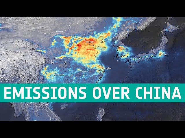
A look at the NO2 pollution levels in major cities in China, as well as Seoul. Between December 2019 and March 2020. European Space Agency
Bernard’s maps visualize major cities from around the world. These include Milan, London, Los Angeles, Moscow, and Tehran, among others. The purple denotes a higher density of NO2 per square meter, and yellow denotes less. And in every case, it’s easy to see a staggering drop-off in NO2 levels after just 36 days of quarantines occurring on a worldwide scale. Note, however, that each city’s visualization is a different zoom level; meaning comparing cities to each other, rather than just the before-and-after pollution levels of individual cities, may be misleading.
There have been other mind-blowing visualizations of the pollution dip that’s resulted from the COVID-19 quarantines as well, including the one below of China from the European Space Agency. But seeing the phenomenon first hand definitely helps to ground the maps in the real world. Which is, apparently, getting its first, real breath of fresh air since the Industrial Revolution.
![]()
What do you think about these visualizations of NO2 pollution levels in major cities before and after the worldwide COVID-19 lockdowns? Does this visceral encounter with clean air make you want to get an electric vehicle or go solar? Let us know your thoughts in the comments!
Feature image: European Space Agency