Here at Geek & Sundry, we’re all about accessible gaming, from showcasing diversity in games to bringing a spotlight to publishers and organizations who make games accessible for all gamers.
We previously discussed how publishers have begun listening to colorblind players and are making changes to increase their games’ accessibility. From colorblind-friendly colors and hues to unique icons complementing each color, games have become easier to play for those with vision issues.
But what do colorblind players like myself do when there are so many games already out there that aren’t colorblind friendly? For most of us, we’re not tossing aside a great game simply because of a publisher’s failure or inability to address accessibility. We take matters into our own hands and do it ourselves, with some help from readily available supplies.
Here are five great games that were made color-blind accessible with a few minor changes to their components.
Paris Connection

Queen Games is known for its top-notch components and Paris Connection is a fine example of their production quality. This underrated gateway game of stock manipulation features terrific train meeples and a big, beautiful map of France. Unfortunately, the purple and brown trains are not easy to distinguish from each other.
I took some white paint and added a small, unobtrusive dot on each brown train. It doesn’t distract other players from the game, but for colorblind players like me it’s a lifesaver: now I could confidently choose the trains I want to increase or decrease in value each turn.
The Castles of Burgundy
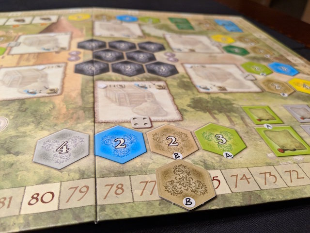
Stefan Feld’s games are infamous with colorblind players. It’s as if publishers go out of their way to make his games unplayable by anyone with even the mildest form of color blindness. The similar shades of green, brown, and tan in his games challenge even those with perfect vision.
For Feld’s classic The Castles of Burgundy, I bought a package of stickers and used them to label the tiles and various spots on the board. I wrote “A” for animals,”B” for buildings, etc., on the board and tiles. You could do these with any of the tiles you’re having trouble with, whether it’s “S” for ships, “M” for mines, etc.
Harvest Dice

Harvest Dice is a fun roll-and-write game about farming, but the original red, green, and orange dice tend to blend together. Thankfully, this was an easy fix: simply swap out the game’s dice for ones that are easier for colorblind players to see. Your FLGS should have plenty of dice to choose from that’ll be easier to see on the table.
Viticulture Essential Edition
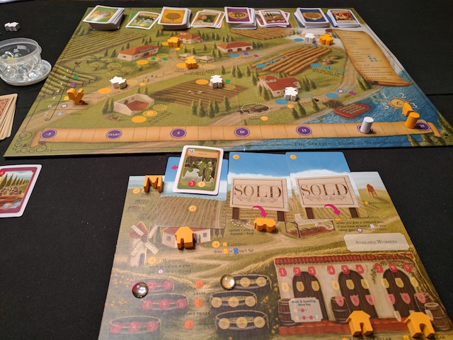
Viticulture is one of my favorite games of all-time, a worker-placement classic of winemaking set in pre-modern Tuscany. My only nitpick: the visitor cards are small and since they refer to other cards via colors, it’s tough to tell them apart.
I created a spreadsheet with a simple explanation of what colors each visitor card is referring to. For example, if a player was having trouble figuring out whether the Craftsman draws a blue or purple card, then they refer to the chart and see that it’s a purple card. It can be printed or downloaded for quick in-game reference.
The spreadsheet has been updated to include the Tuscany and the Moor Visitors expansion and you can download it from Board Game Geek.
Yamatai

In our previous article on color-blind accessibility, Yamatai was cited as the worst board game in terms of color-blind accessibility. It’s even more infuriating when you consider that Days of Wonder publishes Ticket to Ride, a shining example of a colorblind-friendly board game.
Although not colorblind himself, Marlon Estella, an IT director based in Southern California, decided that one of his favorite games wouldn’t be ruined by oversights by the game’s publisher.
“I want everyone to enjoy and have fun,” he said. “For colorblind players, it may be a little embarrassing to continually stop the game to ask what color is this boat or that boat. For others it can possibly frustrate them due to the stoppage. And then no one is having fun.”
Estella took a permanent marker to his copy of Yamatai and used a system of pips to identify each boat and building: one pip for green, two pips for brown, and so on.
“Of course, this won’t get rid of the colorblind issues altogether,” he said, “but with this customization, someone who is colorblind will be able to play Yamatai.”
Have you customized your board games? Tell us in the comments! And be sure to join us on April 28th on Twitch for our International Tabletop Day stream hosted by Ivan van Norman, and help us support charity:water to raise money for a project to get water to a community of people who currently lack access to clean water.
WANT MORE BOARD GAME GOODNESS?
- Learn how publishers are making games more color-blind friendly.
- Find out how Meeple Like Us is improving accessibility to board games.
- Check out these blinged-out board games.
Image Credits: Ruel Gaviola
Ruel Gaviola is a writer based in Southern California. He loves board games, books, cooking, traveling, Star Wars, and date nights with his wife. He reviews games and reports news for iSlaytheDragon, podcasts with The Five By, and his name rhymes with Superman’s Kryptonian name. Follow him on Twitter and read his blog here.